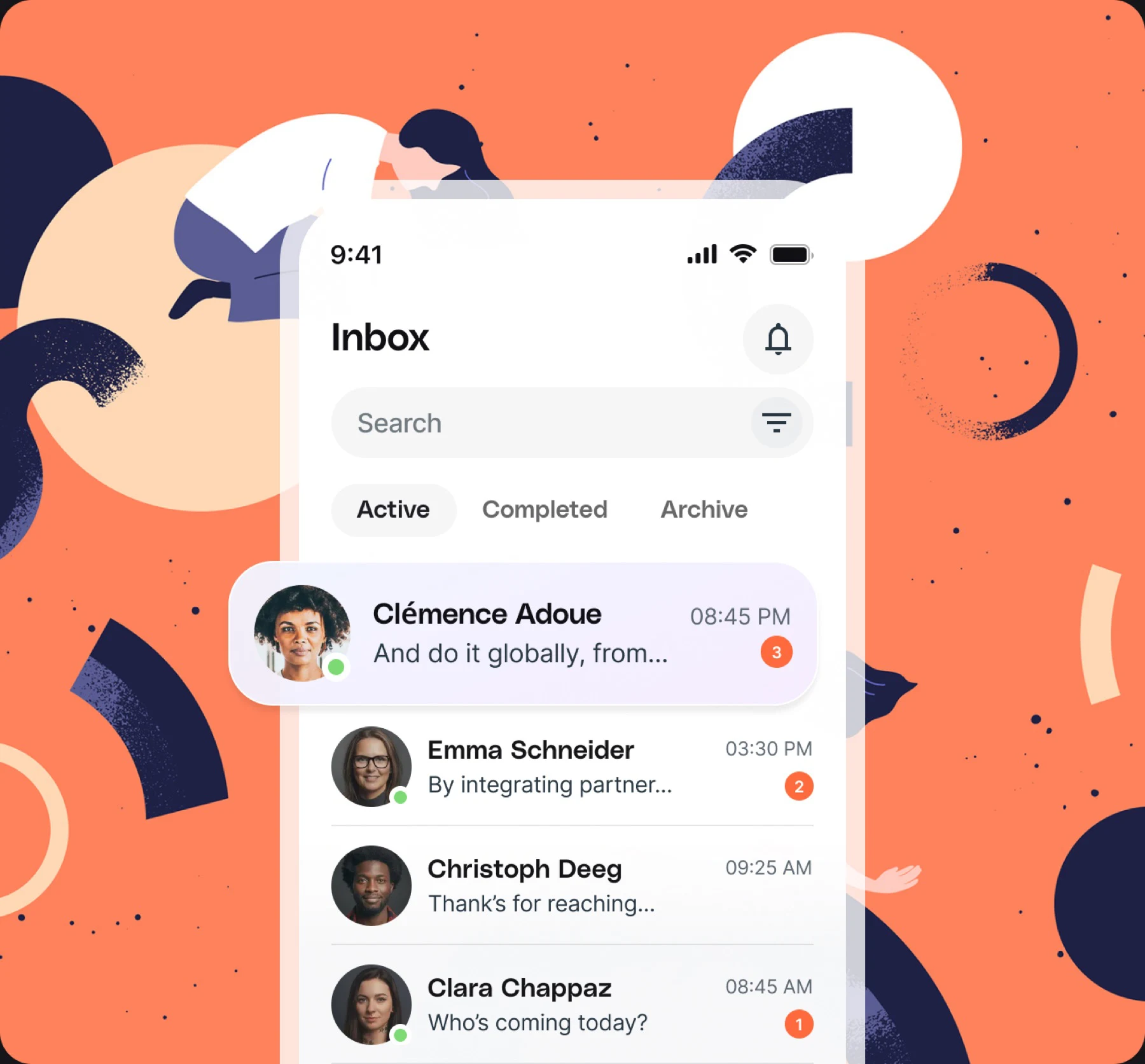
When Stampic asked us to help them grow, the brief was simple: more people using the app, more often. The answer turned out to be a series of small, compounding improvements rather than one big redesign.
1. Shorten the first minute
We cut onboarding from six screens to two and let people collect their first stamp before creating an account.
2. Make notifications earn their place
Every notification had to answer one question: is this useful right now? We removed half of them, and engagement went up.
3. Treat the inbox as the home screen
Rewards, messages and offers moved into one calm inbox, which became the most visited screen in the app.
Together these changes drove a 93% surge in mobile traffic within two quarters.